Showing posts with label design. Show all posts

Wednesday, 2 September 2009

Making Noise with ImageMagick

The Case for Noise

At the @media conference earlier this year, Dan Rubin presented a talk entitled Designing Virtual Realism where he explained that we should try to reproduce real life textures when designing web sites to produce the feel bit in look & feel. If you are as useless with Photoshop or GIMP as I am, it is quite a difficult feat. However, Dan also had advice for visual design challenged people like me: if you do nothing else, at the very least, add noise. What he meant by that is to replace flat background colours with something that is not quite flat, adding subtle noise to the colour. As usual, ImageMagick is a great tool for that sort of things and gives you the opportunity to automate it.

Creating Noise

ImageMagick has an option to create random noise, which makes it very easy to start. Enter the following in a terminal window:

$ convert -size 100x100 xc: +noise Random noise.png

This will produce a PNG image 100 pixels wide by 100 pixels tall that will look something like this:

noise.png

Noise image

Note that because the pixels in this image are completely random, it can be tiled, which is important if we want to use the final image as a tiled background.

Blurring the Noise

Next we need to blur the noise and desaturate it so that we can use it as a mask.

$ convert noise.png -virtual-pixel tile \
 -blur 0x1 -fx intensity -normalize noise-mask.png

Let's decompose this command to understand all the options:

-virtual-pixel tile
tells ImageMagick to use a tile of the picture for virtual pixels that are outside of the boundaries of the original. This is necessary because the blur algorithm uses neighbouring pixels to calculate a given colour. Using that option ensures that the result of the blur can also be used as a tile.
-blur 0x1
applies a fine blur to the image.
-fx intensity
selects the intensity channel only thus desaturating the image.
-normalize
stretches the contrast to ensure we go from pure black to pure white rather than average greys.

And here is the result:

noise-mask.png

Plain Colour Tiles

We then need two plain colour tiles that will be combined into the final image. Both colours should be very close to one another so that the noise is perceivable but not distracting. In this example, I will use two shades of red:

$ convert -size 100x100 xc:white -fill '#cc0000' -opaque white red1.png
$ convert -size 100x100 xc:white -fill '#bb0000' -opaque white red2.png

This is a rather weird syntax so let's explain it:

-size 100x100
creates an image that is 100x100 pixels.
xc:white
uses a pseudo-image that is completely white as a source image.
-fill '#cc0000'
selects the fill colour to be used by any following option, in this case a shade of red.
-opaque white
replaces all white pixels in the image (in this case the whole image) with the fill colour (red).

That's a bit convoluted but I haven't found a way to specify a hex colour value directly after xc:. If anybody knows better, please tell me.

Applying the Mask

The last step is to apply the mask created earlier to mix the two colour tiles:

$ convert red1.png red2.png noise-mask.png -composite red-noise.png

Et voilĂ ! Some noise added to our plain red. And here is how the two compare, plain red on the left, noisy red on the right:

Plain Red vs Noisy Red

The difference is subtle but enough to give an impression of texture.

Script It

Last but not least, let's transform all of the above in a small shell script to be re-used later. Note that I am using bash here, which will work fine on Ubuntu or Mac OS-X but you may need to adapt it if you are using a different operating system:

noise.sh

#!/bin/bash

# Retrieve parameters and assign defaults if not found
size=${1:-50x50}
col1=${2:-#000000}
col2=${3:-#111111}
ofile=${4:-noise.png}

# Set the name of the temporary mask file
mask=/tmp/$$-mask.png

# Create temporary mask
convert -size $size xc: +noise Random -virtual-pixel tile\
        -blur 0x1 -fx intensity -normalize $mask

# Create both colours and compose with mask
convert -size $size xc:white -fill $col1 -opaque white\
        -size $size xc:white -fill $col2 -opaque white\
        $mask -composite $ofile
 
# Delete temporary file
rm $mask

To use it, you need to make it executable first:

$ chmod +x noise.sh

Then it's just a case of giving it a size, two colours and an output file name as parameters:

$ ./noise.sh 100x100 '#00cc00' '#00bb00' green-noise.png

Now, go make some noise and banish those boring plain backgrounds!

Saturday, 14 February 2009

Designing Good Error Handling

Usability is an important subject in software design. Your application can be the coolest thing since sliced bread, if it's difficult to use, people will just not bother. We all know that. There are lots of books and articles on usability. However, such material often forgets about one important aspect of usability: error handling and messages. When your application encounters an error, whether it is due to something the user did or to a bug, it is extremely important to ensure it behaves in a way that makes sense to the user, even more important than for normal behaviour. This is because when an error occurs, your user will typically be stopped in his tracks and asked to resolve a problem he wasn't expecting to be faced with. If the error handling adds to the confusion rather than help, the user will not know what to do and his confidence about the application and his own ability to understand it will significantly diminish. So here are a couple of example of what not to do, helpfully provided over the past week by applications I use at work.

Cryptic error message

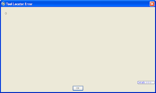
We use Borland StarTeam at work to manage change and configuration. When starting the application earlier this week, I was faced with the following error message:

Borland StarTeam error message consisting of a single zero

Yes, the error message consists of a single zero. Difficult to do any shorter or any more cryptic. At that point, I am given two options: a Details button and an OK one. Assuming the Details button may lead me to a more understable explanation, I clicked it and it showed me the following message:

Borland StarTeam detailed error message showing a Java exception

This is absolutely meaningless for anybody who is not a Java developer. And even for those who are, it doesn't really help, it only shows that there is a bug in the product where an internal array is not checked for size before accessing its first entry. It doesn't tell me whether the application will keep working or whether it will horribly crash when I click OK. It so happens that clicking OK made the message box disappear and the application kept working normally after that.

So, how can we improve on such a message? The best way in my opinion would be to display a message to the user explaining that an internal problem has occurred in the application and how they can report it to Borland. What is displayed in the details screen would be invaluable to the developers in order to correct the bug. So directions on how to send that information to the product team would make the user feel that the company cares about the qulity of their product and that they are ready to receive bug reports. Not all users would actually go through the steps of reporting the bug but some would.

Lack of information

Another error I was faced with this week came from the automated backup tool. This tool, which is installed on all laptops will continually backup changes in the user's folder to a central server. It runs in the background, is relatively unobtrusive and flexible enough that you can select sub-directories that you don't want to have backed up. However, it sometimes require your attention and will pop up a message. I was faced with this one yesterday:

Error message saying: Part-complete actions have been found due to an interruption during last sync. Click OK to complete there actions before scanning. Click Cancel to continue with the scan and ignore the part-completed actions

Contrary to the previous example, this message is in plain English and I can understand every word of it. However, it is worded in such a generic way that I have no idea whether I should click OK or Cancel. I don't know what part-completed actions it refers to and therefore don't know whether those actions should be completed or not. I suspect that they should because the default button is the OK one but I can't be sure. Also note that the word scan is misleading: it only makes sense to me because I have a fair idea of how the backup tool works but it could make the user think this is a message from the anti-virus system.

So, what could be done to make it more useful? First, the message should identify what application triggered it. It is important in this case because it is triggered by a background process and is completely unrelated to what the user was doing at the time. Then the obvious thing to do would be to detail what actions are pending and require attention. However, this may not be enough. If the actions' descriptions are too cryptic, that won't help the user make a decision. So the message should also ensure that the descriptions for the pending actions are clear and concise.

Conclusion

Usability is good but it should also go hand in hand with error handling. So next time you design a piece of software, make sure all the error messages that can potentially be displayed to the user are clear and include enough information, especially if the user is expected to take a decision based on the message. If the message is triggered by an unexpected error, consider giving the user a way to report the error so that you can correct the bug in a subsequent version.

Friday, 31 October 2008

New Template

I was getting bored of this weblog's template. After all, I've been using it since I created it so it was time for a change. I decided to go with Blogger's standard TicTac Blue as it was designed by one of my favourite web designers, Can Cederholm of SimpleBits fame. Of course, I'll probably end up customising it.